Rogen Neilson House
Website redesign case study
Website redesign case study
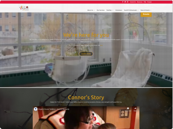
Our group proposed the re-designing of a not-for-profit organization’s webpage. We selected the redesign of Roger Neilson House, a palliative care facility in Ottawa, Ontario, Canada. Our initial evaluation was that the site required branding overhauls, UI assistance and readability.
Type: Bootcamp group project
The problems we faced are mostly about readability and finding useful content about the organization itself.
We put ourself in the shoes of a user trying to apply to a volunteer position and filling up forms.
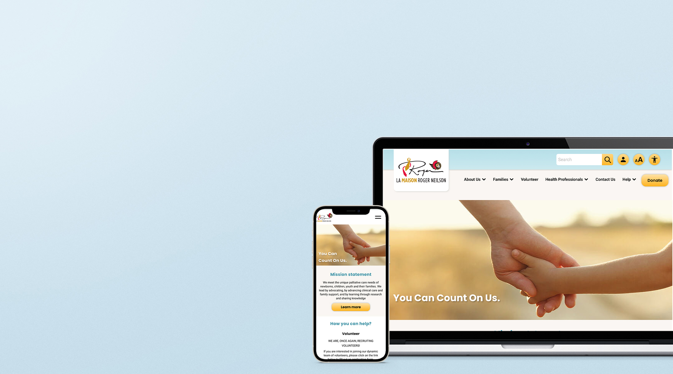
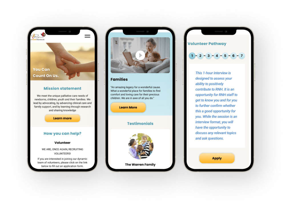
Revising the navigation bar, adding a visible “about us” section to enhance clarity about the organization itself.
Redesign the volunteer application process to make it easier for the user to apply. (step-by-step forms and possibility to save

User Research
Heuristic
Evaluation
User Interviews
and insights

Definition & Ideation
User Insight
and problem statement
User Journey Map

Prototyping
Wireframes
Ui Design
Hi-Fi Prototype
For redesign the existing website it was important to define the elements that need to changed.
The Heuristic evaluation of the homepage revealed that:
Usability:
The volunteer application process has been redesigned to maximize a positive user experience. We’ve observed that users are less likely to complete the application process if required to re-enter information. How might we save a user’s information to make the application process less redundant?
We will measure the level of success by an increased volume of applications and time spent on the task.
Volunteers needs to have a way to save information as they go about the volunteer application process because having to re-enter information discourage them from completing the volunteer application process.
The volunteer application process has been redesigned to maximize a positive user experience. We’ve observed that users are less likely to complete the application process if required to re-enter information. How might we save a user’s information to make the application process less redundant?
We will measure the level of success by an increased volume of applications and time spent on the task.
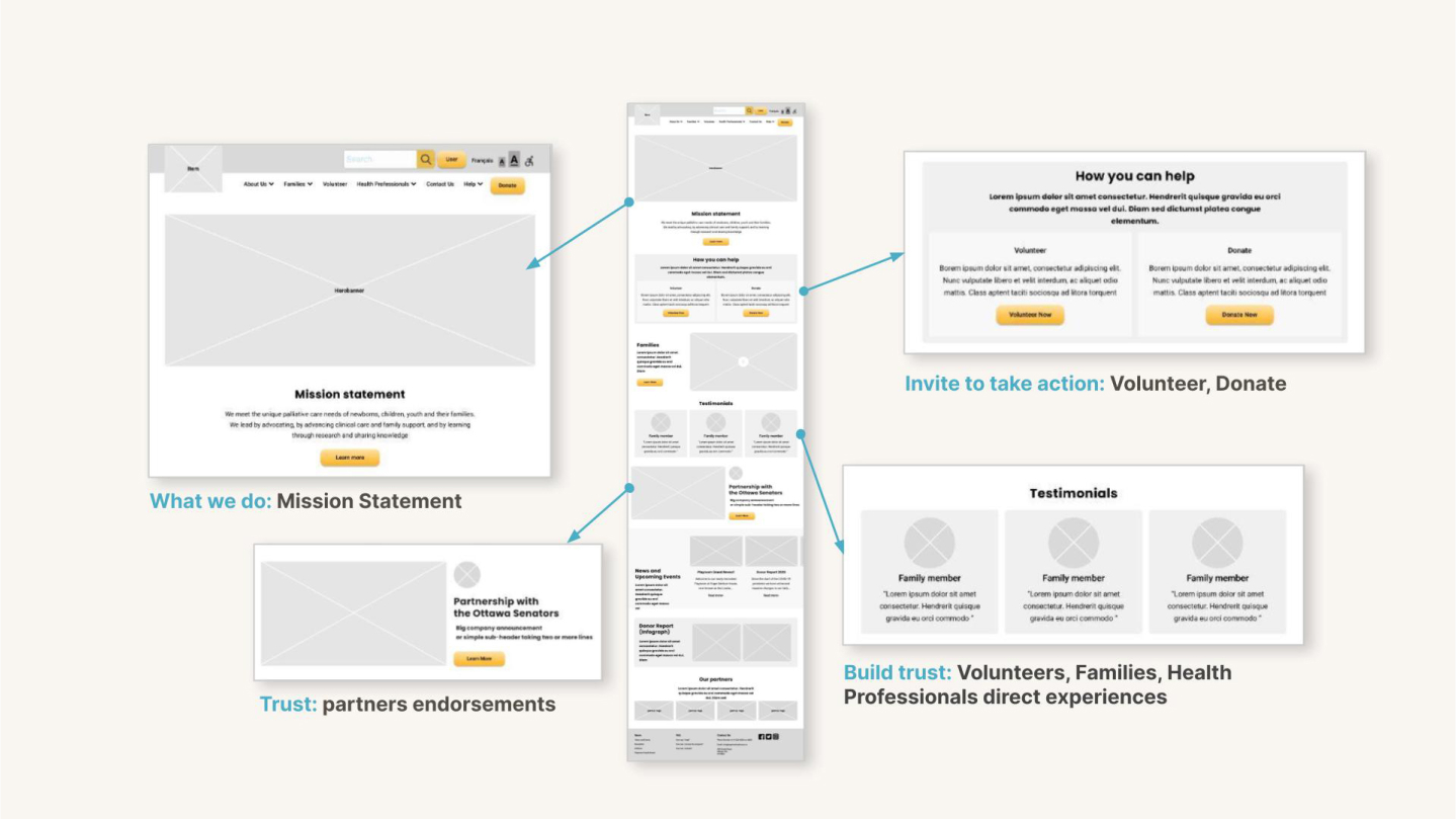
Using Figma, we translated the first sketches into low-fidelity wireframes. At this stage, the wireframes were defined enough for some user testing. Based on 5 tests, we’ve made a few alternations and moved on to creating high-fidelity prototypes.How much time do you expect to spend when applying for something?What is your biggest frustration in the application process?
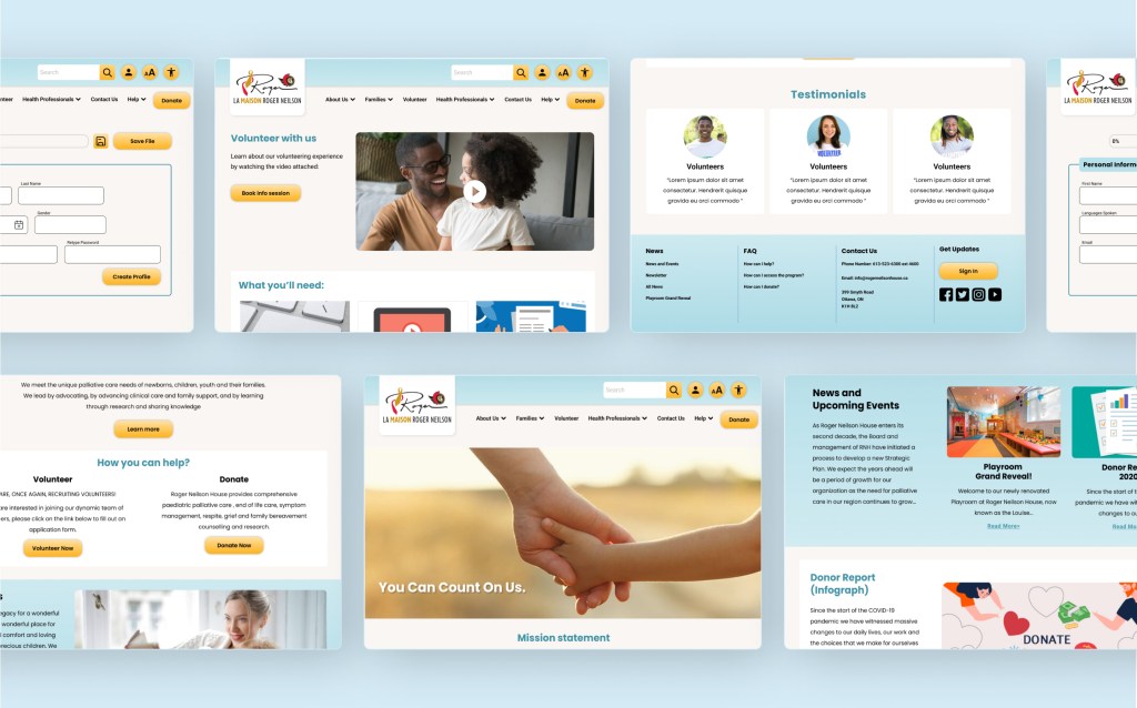
The UI was designed around some of the comments of our early interviews: potential users would enjoy bright colours, readable text and a combination of imagery both from stock and amatour from families, volunteers and community events. For the colour palette we chose an energetic orange, to call for action and turquoise recalling a calming and safe environment.
With a timeline of only 3 weeks we had to give up
to several features that need an implementation.
Iterate high contrast
and larger font modes for accessibility increased legibility
Contact Us Form
Hero banner carousel
Add French icon
on navigation bar
The project was an eye opener for our group and I’m glad we worked well together. We really understood where our single strengths were and we organically leaned to the parts of the process we were better at. I was personally tending towards the story telling part, to really understand our users and their pain points. Then the initial wireframes and the UI design.
I’ve also learned to don’t get attached to any solution or design because there is always room for improvement.
